Covid-19: Analysis of Mortality Data
Data source: The CDC, my spreadsheets are here and here which should be easier to work with.
Previous Covid-19 work here that is potentially relevant these days: Covid 7/9: Lies, Damn Lies and Death Rates, Covid 7/2: It Could Be Worse, Covid-19: My Current Model, On R0, Taking Initial Viral Load Seriously, On “COVID-19 Superspreader Events in 28 Countries: Critical Patterns and Lessons”
Something very bizarre seemed to be happening with the death data.
This post attempts to figure out what the hell is going on. The obvious first explanations didn't seem to fit the data.
It now looks like the main effect discussed is mostly delays. This is mostly deaths that are pending - it really does take months and months, somehow, for us to figure out what killed a substantial fraction of those who die. Thanks to a screenshot in the comments I was able to compare data from different snapshots, and confirm this.
Thus, we can treat most of this as a fun little exercise that still revealed a bunch of interesting and useful stuff along the way. The C.D.C. seems to have put out a report on this years ago, here.
I've chosen to mostly leave the rest of this post unedited, to reflect the thinking process. I think it's important to learn from such things, to get better at analyzing things and figuring things out.
Death Reporting Delayed Not Death Reporting Denied, Is Actually Death Reporting Backdated Or Something
We'll start with the basic problem of delays.
The C.D.C.'s data set takes a while to fill in. I downloaded my data set on July 10. At that time, the last week on record in the data was the week of June 27, already two weeks old.
That two week delay didn't even seem like enough. The week of 6/27 we only see 49% of the previous year's overall death rate (note: I do smoothing with the two surrounding weeks throughout this post for 2019, whenever possible). The week of 6/20 we only see 81%, and the week of 6/1 we only see 95%. No other week is under 99%. The 95% is possible, but the 81% isn't. There is at least a four week delay in reporting a substantial number of deaths.
[Added later: Note that the C.D.C. report the other post linked to actually has more of a delay in reporting than this! It says that ten weeks out only 80% of all deaths are available for analysis. My brain doesn't know to process that. Even after verifying it with a different snapshot, I don't actually understand what takes this long. If anyone has an explanation I'd love to read it.]
Figure 1:
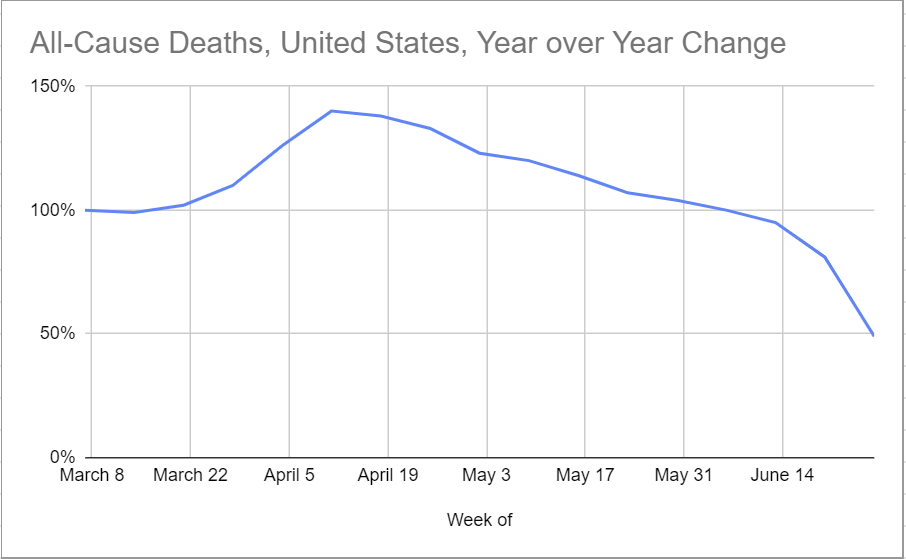
That's a bit odd. It should not take a month to collect this data. Somehow, it does.
To get a sense of how this was interacting with the Covid-19 reporting, I charted deaths from Covid-19 from both sources.
Figure 2:
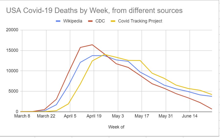
C.D.C. is reporting deaths earlier, with an even bigger spike in early April, then the number drops off rapidly. If you add everything up the C.D.C. is reporting 99% of the total number of deaths found in Wikipedia's numbers - Wikipedia during this period reports 115,891 and C.D.C. reports 114,417. Covid Tracking Project has 118,439.
The week of June 13 it's missing 20% of the death count (5609 vs. 4436), week of June 20 it's missing almost half the count (2257 vs. 4136), week of June 27 it's not even trying yet (3778 vs. 653).
I believe this is partly Wikipedia doing deltas in death counts - how many deaths recorded so far as of today, versus that count yesterday - versus the C.D.C. attempting to have a date of death for each person. Thus, when adjustments are made, Wikipedia moves them forward in time.
That makes the larger April spike in the C.D.C. data presumably real. There's no reason it can't fit the other data we have.
It doesn't make the dramatic drop later on real. It can't be fully real even if we exclude the final weeks. The shape of that curve is not a thing that happens alongside our other data points. It's dropping a constant amount per week in absolute terms, rather than percentage terms. It's doing so in a way that can't account for the rates and quantities of positive tests.
Note that recent Covid-19 death tracking here is well behind general death tracking. For the week of July 27, we recall that 49% of last year's deaths were reported. If we roughly believe the 100% of last year's death rate for the week of June 6 is roughly correct (e.g. locking down prevents other deaths or moves them forward enough to cancel out the direct Covid-19 deaths) then it's hard to imagine this number for June 27 being outside a range of about (85%, 105%), which means at most roughly 50% of them are missing. The Covid-19 deaths in this data for that period are about 85% missing based on officially reported numbers only.
That is far too big a difference to be accounted for from time shifting. There is certainly some reclassification involved (e.g. the one from New Jersey) that explains some of the difference, but nothing close to all of it unless I'm missing something big. It has to be some sort of reporting delay or failure. I can't explain it. I am curious what others make of it.
What's causing all this? Does anyone know or have a theory?
Causes of Death
Time to split out other causes of death. Here's a chart of all the different categories offered by the C.D.C. other than Covid-19, in terms of year over year change in death rates, excluding the one that would have entirely messed up the chart:
Figure 3 (not corrected for lack of data in the last few weeks):
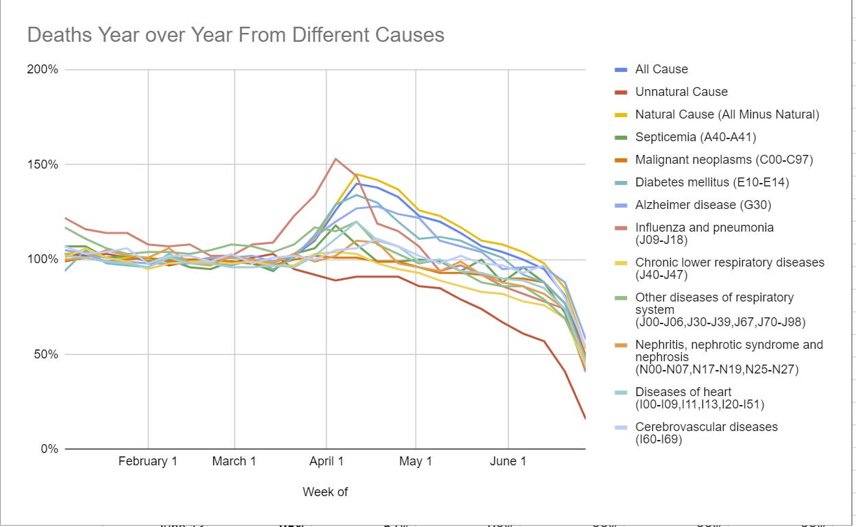
Some causes had a spike in April along with Covid-19 deaths. Other causes didn't. The chart is hard to read because it has so much on it, and also the drop-off at the end needs to be corrected for. Plus the whole missing line issue.
We see a few causes that seem to have dramatically rose in April. Diabetes deaths rose 31% during the key weeks of April 4, 11 and 18. Influenza deaths rose 39%. Alzheimer deaths were up 25%. Heart deaths rose 13%. Generic 'other diseases' rose 14%. A few others rose a little as well.
It seems reasonable to attribute the smaller rises to lack of medical care, both lack of capacity and reluctance to seek it out. For Alzheimer's, Diabetes and Influenza, I don't buy that at all. They make way too much sense as being Covid-19 deaths that were misclassified, given the numbers rose far more than other medical causes that had the same issue with lack of care. At best, we can say that a 14% rise was due to lack of care, and the rest of the surge in deaths was actually Covid-19. That is not that big an impact on overall outcomes, as it would only add 3,004 deaths to our total, but it's worth noting.
For the figures that follow, we are looking at the percentage change in percentage of deaths that fall into a category. Thus, when we see that Unnatural Cause deaths are down, that means not in absolute terms but in percentage of all deaths.
Figure 4 (% change in percentage of all reported deaths, year over year):
[Added later: Reported as of July 10. We now know that this is because unnatural cause deaths take a lot longer to get sorted out. But again, the decline being so huge still boggles me and my model doesn't know how to process it yet.]
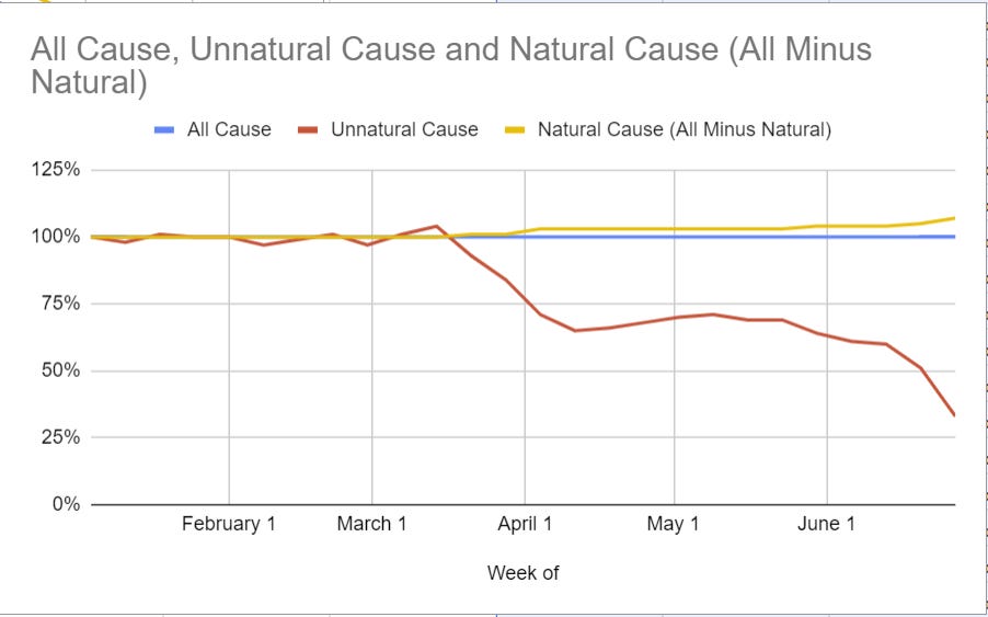
All cause is always 100% here by definition. What this shows is the plummeting share of deaths that are not classified as natural.
We see a large drop in March and April. That drop makes sense, as there were lots of Covid-19 deaths, and those additional deaths account for most of the drop - in absolute terms you can see in Figure 3 that the effect was small.
Then Covid-19 deaths fall off, and lockdown conditions get less strict as we move from May into June, and the proportion keeps falling.
This is a clear example of why it's hard to tell a consistent story about what is happening here unless delays are somehow highly variable and a gigantic factor. The last week could be that in unnatural death there is a larger than usual delay so there can be an investigation into potential Murder Most Foul, but this effect seems super dramatic. What are they doing that takes months? And the timing involved, where the main effect happens in May, doesn't seem to line up with observed behavior changes. We certainly didn't lock down a little in April and then dramatically more in May. So again. What the heck is going on here?
With all that out of the way, let's get to the heart of the matter. The R00-R99 series of classifications, sometimes called 'mysterious deaths,' covers a bunch of generic labels including R99, 'Ill-defined and unknown cause of mortality.' Which I've seen the claims is often merely a placeholder to be replaced later. Most are of the form 'Symptoms and signs involving system X' without specifying a cause as such.
Figure 5 (% change in percentage of all reported deaths, year over year):
[Added later: Again, as of July 10 for all figures, and we now understand where this is coming from.]
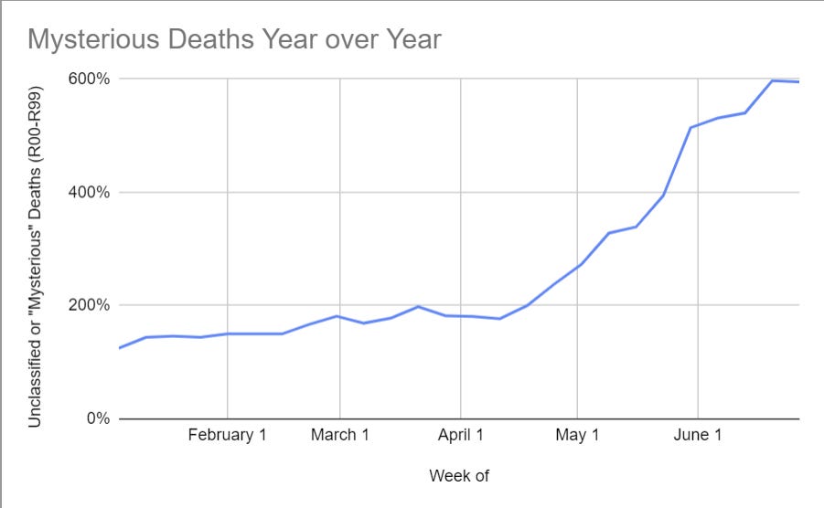
Figure 6: To drive that home, here's the percentage of all deaths that are classified R00-R99:
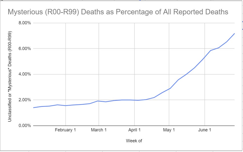
There is a gradual increase up until about April 8. Then it's a straight line up with no end in sight.
New York's jump in mysterious deaths follows a similar pattern, although with a smaller peak. During the worst of it they were running 230% of normal, and since then it's been 300% of normal or more.
New Jersey does have its jump at the same time as its death count jump, which isn't a pattern found in other states. Probably a fluke.
Doing some other state spot checks:
Arizona had a big jump in early May, well before its case counts took off.
California's pattern is similar to the overall country, with a similar rise and percentage of all deaths, but starting from a smaller baseline. California used to not have many mysteries and the rates have gone up by a factor of 10. Some smaller states didn't used to report them at all.
Georgia seems not to have a surge, which is interesting. Nor does Minnesota.
Illinois has a larger than average jump, similar to California's, with counts over 10% of deaths for the weeks with incomplete data. Tennessee is similar. Ohio has the same thing even bigger.
Massachusetts is typical, as is Michigan, as is Pennsylvania. As are Texas and Florida.
Some of this can be a backlog of medical attention to finding causes of death, but that effect would center in April. It wouldn't explode in June.
Some of this can be delays where deaths will later be reclassified, perhaps. Someone who knows more can help out on that. I am hugely skeptical that this will explain a large portion of what we're seeing, or that this curve is remotely normal. How many death causes are revised weeks after the event? I do not believe such events are common.
Over 26,000 extra deaths have been placed in this category. Almost 15,000 of those fall between May 3 and June 20, versus about 50,000 reported Covid-19 deaths during that period.
This is not a small effect. Normally about 1.2% of all deaths fall into the R00-R99 categories. By the end of this graph that number is above 7%. Six percent of deaths that used to be understood are no longer understood, despite there being general labels for "Covid-19" and "Covid-19 with multiple causes of death."
Neither is it a truly gigantic effect in absolute terms. At least, not yet. This isn't big enough to hide a massive surge in deaths.
The timing here represents some effect that started becoming a big deal in April, then accelerated. This isn't primarily a physical effect. It's a reporting effect.
What is up?
Possible Theories
Let’s recap and see if we can expand upon our possible theories.
Delays
This is the best possible outcome. It's not wonderful, but it's way better than the alternative.
Maybe delays really are this bad all the time, and lots of deaths are constantly getting reclassified over time. In this theory, even six months later in July of 2020, we have some doubts about deaths in January 2020, which results in a slightly (~25%) elevation in R-class deaths.
[Added later: That's the theory this blog settled on - I think I originally learned about this from there, then never saw the retraction. It looks like that retraction got it right. A rough calculation says that 90% of the gap is due to delays that are typical, and only 10% remains to be explained by other factors.]
If we had a historical copy of this page we could confirm or deny this theory easily, slash measure the magnitude of this effect. For now, I don't have one. By waiting, we’ll get a similar effect, since the version referenced above becomes the past version.
[Added later: Yep, that method worked. Delays confirmed.]
I’ll proceed as if this is not a major cause of the issue, keeping in mind I might be doing a what-if exercise if next week suddenly everything is falling into place at one week per week.
Lack of Resources
Under this theory, medical examiners and others looking to figure out causes of death are increasingly overwhelmed.
The problem is that the timing does not make sense. Remember, this is the deaths chart for Covid-19 (Figure 7):
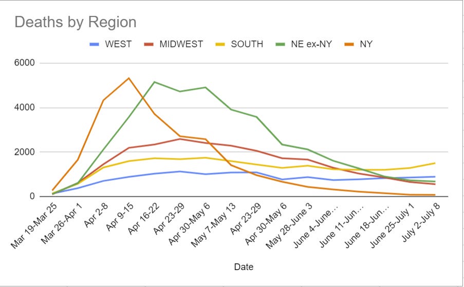
Hospitals are now being overwhelmed in the South, but during May and June there was a lot of capacity being held in reserve that was never used. Most places did not have such problems. And in the worst of it, in April, we don't see much of an increase in R-class deaths.
Perhaps the backlog isn't medical, but instead it's police? It's become increasingly hard for them to do their jobs, a lot of them are on a sort of soft strike, and they've got extra work to do that's going to make it that much harder to clear cases. If the spike started when Floyd died, that would make sense, but it starts well before that. So again, timing doesn't seem right.
One could argue that it's a backlog - things get more and more delayed - as a sort of hybrid of these two arguments, but that does not seem to me to work either.
Actual Additional Cause of Death
Maybe this isn't a data artifact?
This would be extremely alarming! There would be something out there killing people at a rapidly increasing rate, and we have no idea what it is. At a minimum, no one is talking about it.
I very much doubt that this is true. It would have to be an infection of some kind, and in the current climate I don't see how this could remain hidden this long while being this prevalent. So this seems necessary to note, but not much of a consideration.
Change in Methodology
Maybe there are things that used to count as something in another group that have been reclassified, so now the category is on the rise?
I don't know of any change in methodology. Presumably if there had been one nationwide someone would have mentioned it by now, given what else is going on. Seems like quite a news story. Also once again, the timeline does not work. Rules changes mostly happen at once, or at once in a given place. This doesn't match that pattern.
Manipulation of Data by the Government
Maybe this is states looking for an excuse to reopen?
That was my first hypothesis.
Not at the state level. The pattern of where it is happening is too universal, and the places with the most motivation to do it, where there was clearly other fishy stuff going on, are not seeing larger effects.
If there's manipulation of the numbers by the government, it would have to be coming from the C.D.C. or somewhere else in the federal government. Could the C.D.C. pull this off if it was sufficiently corrupted by Trump to want to do it? I don't think it has any control over the numbers, it only tabulates them. If I'm wrong, please correct this.
Manipulation of Data by Others
The question here would be not only how, but why.
This would have to be local. It isn't a big conspiracy or coordinated countrywide effort. Those don't parse. If this is it, it is the sum of individual decisions made for local reasons. What might those reasons be?
One theory for which I have anecdotal evidence is that this is people lying because they're worried about people freaking out or potential liability.
A distant relative of mine (who I've never actually met) who lives in a group home for the elderly went to the hospital, recovered, and returned to the home. The home told us he had, well, something other than Covid-19. The hospital told the patient he'd had Covid-19. Armed with that information, another relative of mine was able to get the home to admit that yes, this man had suffered from Covid-19.
They then claimed, when asked, that they had no other cases of Covid-19. It was pointed out that this man literally never went outside, so that seemed rather implausible.
It is easy to see why such a cover-up would be appealing. Everyone hearing about Covid-19 would potentially freak out and demand answers or worse. Much better to say it was something else. If someone died, same principle. Convince everyone that it was something mysterious or random. Who knows what they can get put on a death certificate?
Coroners don't have an obvious first-order reason to get this wrong. But there are presumably plenty of other ways to get the result you want - most of the time the coroner isn't going to do an autopsy and we certainly don't order a Covid-19 test for all deaths.
Extend that logic to a bunch of other situations, and potentially we have our answer. It's the best I've been able to come up with. It still doesn't explain the timeline, but perhaps it can be something people have gradually learned how to pull off? Who knows.
Conclusion
So that's the best I got. The hypothesis is that it is essentially in no one's interest to mark a given death as being from Covid-19, and increasingly our country is deciding not to do that, one certificate at a time. This would reflect a broader breakdown of the rule of law and keeping of accurate records, and should be extremely alarming for that reason.
It also potentially means that there has been an increasingly large undercount in Covid-19 deaths, on top of the previously known undercounts - I'd previously been assuming 50% additional deaths from people who were never diagnosed, at least when things were bad at the height of the 'first wave.'
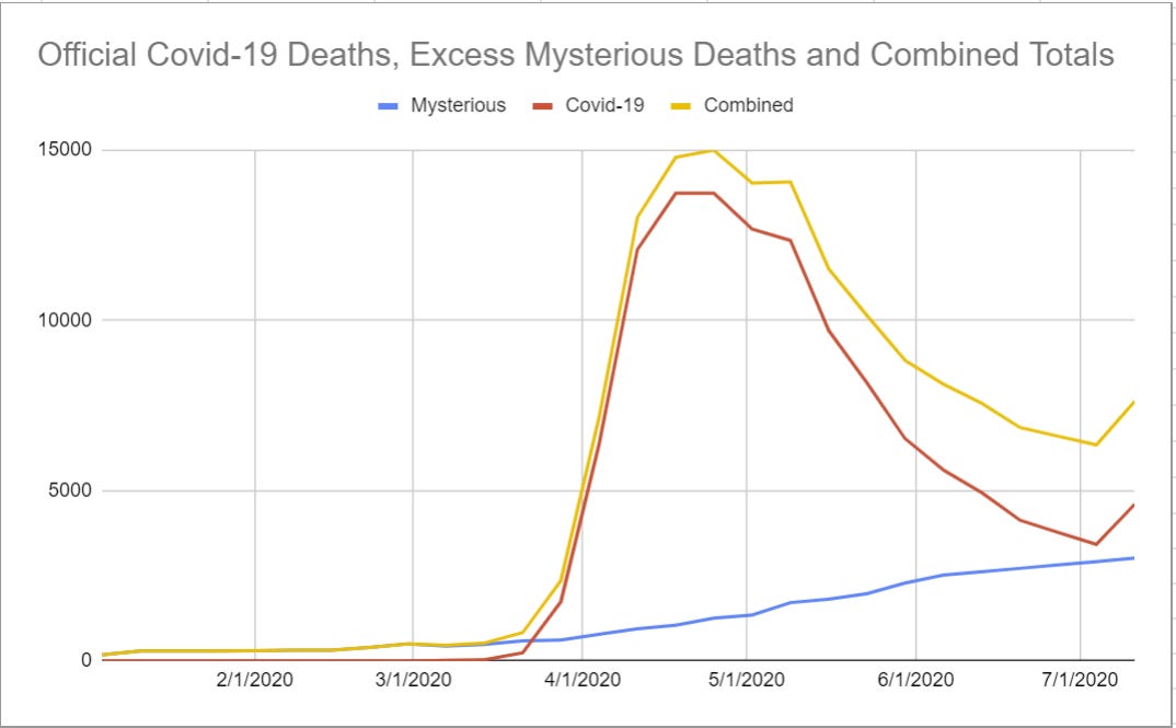
If we assume excess R-class deaths are Covid-19 deaths, and extrapolate out a continued gradual rise, then the decline in death rates looks somewhat less acute.
Figure 8: Deaths from Wikipedia, excess year-over-year R00-R99 deaths, and the combined number. Y-Axis is in deaths per week:
I'm curious what the internet makes of this. Please pass this along to those who might know, and I'll be back with the regular update next week.
New Conclusion (Added Later)
I'm mostly happy with how this turned out. If the speed premium was lower, I would have waited a week to see how the numbers moved, but probably therefore thought about things less and learned less.
We now know with high confidence (I want to wait for a look on 7/17 to be sure, but confidence should be pretty high already) that this effect was ~90% standard issue delays.
That raises the question of how the hell does all this take so long, and whether it takes so long in other places, and whether it is a problem that this takes so long. It seems largely beyond scope, but if you know the answer, I'd love to hear it.
Looking at the analysis, how'd it go?
I'm happy that I wasn't happy with any of the alternate explanations, and knew that I was grasping at straws. I kept realizing that the explanations didn't actually fit the data, for what I think were the right reasons, especially the timing.
Eventually I settled on the theory of manipulation by others as most plausible of the non-delay theories. I noted that it still didn't match the timeline, so I was skeptical, but it still seems right that this was the 'least impossible' of the possibilities raised other than delay.
The real question, of course, is why I didn't think this was delays. The timeline does kind of scream delays, so why didn't I assume that was probably it?
I think the main reason was that I flat out couldn't fathom what the hell the physical cause of such long delays might be. Still can't even now that I know it is there. This is despite repeatedly updating in favor of our government being incompetent and slow in ways one would never have fathomed! Presumably this means I need to update even more in such directions.
The secondary reason is that I was looking for a real cause and looking to reject a non-real cause or the finding that this was a nothing burger. Not explicitly or anything, I did my best to keep an open mind, but on reflection there's no question that I was somewhat biased against this answer. Important to remember that, to help prevent such errors in the future.
I'm happy I went through this exercise, and not only because I can improve my methodology, and my technique for getting help from the general internets, based on what I've learned. Now I can stop worrying about mysterious deaths, and I have a better model of how this country deals death, and with its paperwork. A fine use of time.


