An IHME report came out over the weekend. I was pleasantly surprised by it contents. Its conclusions and projections broadly match what I said in the last Omicron post, with only relatively minor obvious nonsense, and seemed worth their own post to break down.
Headline Takeaways
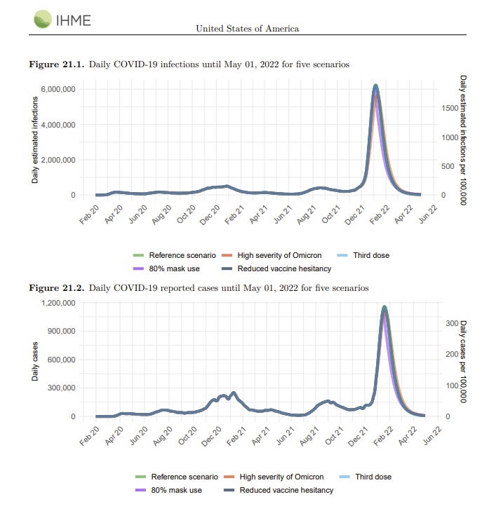
Our models for the United States suggest that infections may be currently peaking at 6 million a day, with varied peaks by state. We expect more than 50% of the US population will be infected with Omicron in the next 6 weeks. The infection-detection rate (IDR) is declining, although shortages of testing may lead to more rapid decreases in the IDR than we currently model. Nevertheless, we expect reported cases to exceed 1 million a day, peak by the third week of January, and then decline sharply.
I too expect reported cases to peak during the third week of January (to be clear, when I say we will peak on 19 January, I mean cases detected on 19 January, not infections that happen on 19 January. If counting from initial infections, I’d have said 16 January, but it’s hard to ever know what the actual lag was there.)
Once the peak arrives, a sharp decline is to be expected shortly thereafter, although I still expect cases to remain elevated (above pre-Omicron levels) for several months.
Note that ‘more than 50%’ sounds like the kind of thing one says when one does not want to make a precise prediction, but there are graphs later on.
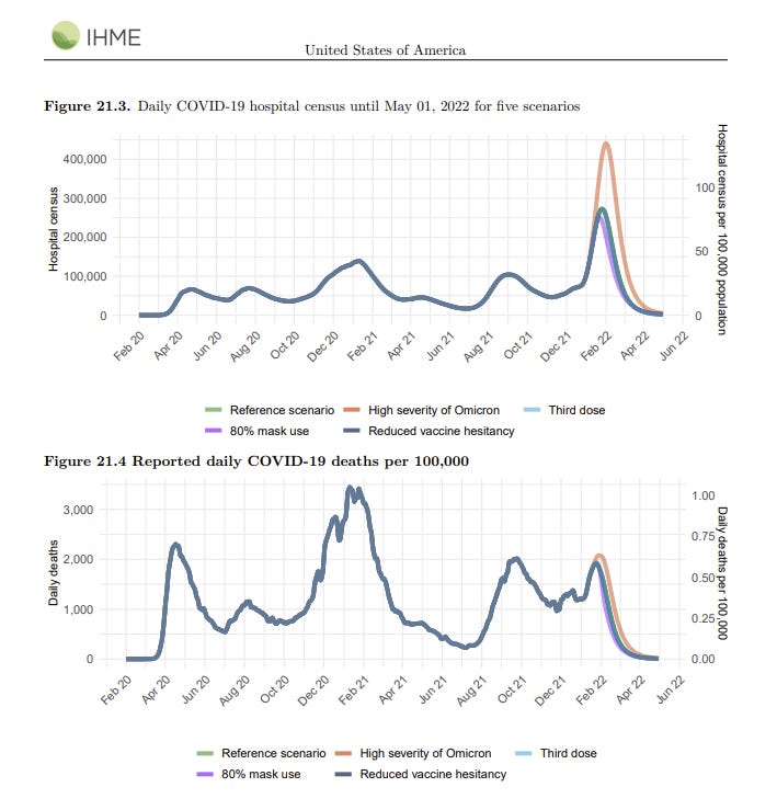
Hospitalizations will increase to a peak that may be twice as high as last winter. These figures, however, include incidental admissions. Because the prevalence of Omicron infection is so high, many individuals hospitalized for other conditions will have asymptomatic infections. Incidental admissions may exceed 50% of total COVID-19 admissions in some states. Daily deaths will increase but remain below 2,000 a day, peaking by the end of the month. This means the peak of deaths will remain below the summer Delta surge and well below the peak last winter.
That sounds like a best case scenario. If hospital admissions peak at twice last winter, but half of them are incidental, then things won’t be substantially worse than last winter. We survived last winter. Deaths peaking below 2,000 per day means they won’t even double once, and the peak will come within a few weeks. Expecting them to peak by month’s end seems wrong given the historical lag times, but it’s only a difference of a few weeks.
Words of high wisdom follow, noting that all of this is baked in.
Our alternative policy scenarios, including more rapid scale-up of boosters to all who have been previously vaccinated, increasing mask use to 80%, and vaccinating the partially hesitant, have only a small impact on the trajectory over the next 4 months. The speed of the epidemic is so fast that policy interventions will have little impact. In previous waves, the control strategy has been to control infection and thus reduce hospitalization and death. Given that there is little prospect of controlling infection, strategies need to focus on reducing harm in the vulnerable and minimizing disruption.
It is essentially too late to do anything but mitigation. If the baseline scenario is as they describe (and roughly as I predict as well) then only those with a strong desire to avoid infection should do much. So this, very much this:
Given the massive numbers of infections in the community, testing and quarantining asymptomatic individuals may not be helpful. There appears to be no prospect for controlling transmission and considerable prospect for disruption of schools and essential services due to screening. States may need to consider revisions to their testing and quarantine strategies.
Quite right. Doing constant testing of asymptomatic schoolchildren makes no sense. My four year old son has had to have four tests in the past week alone.
There’s so much both right and wrong about this caveat:
Considerable uncertainty remains about the future course of the Omicron wave. First, the infection-detection rate may decline even more than we have estimated if testing capacity in states is overwhelmed. This would reduce the reported case rates below the 1.2 million that we have forecasted per day. Second, hospital admission screening will substantially impact the reported COVID-19 admissions. If some hospitals run out of testing capacity and do not screen all admissions, then the incidental COVID-19 admission rate may also decline. Third, a critical factor in understanding the trajectory of Omicron is the fraction of infections that are asymptomatic. Based on data from South Africa and the UK, we currently estimate this to be 80%–90%. Increases or decreases in this fraction asymptomatic have an important impact on the trajectory and severity of the Omicron wave.
The part that’s very right is that the potential lack of testing, and the uncertainty about how many infections are asymptomatic, create extreme uncertainty in measured numbers. However, when they say there’s uncertainty about the ‘course of the Omicron wave’ they are implying that all of the uncertainty is in the measurement of that wave, and any deviations from their projections reflect these changes in measurement.
Their Summary and Graphs
Here is their summary from January 3, edited for readability.
• Daily infections in the last week increased to 5.7 million per day on average compared to 4.0 million the week before.
• Daily hospital census in the last week (through January 3) increased to 99,600 per day on average compared to 76,800 the week before. [January 10: ~136k]
• Daily reported cases in the last week increased to 477,600 per day on average compared to 238,700 the week before (Figure 2.1). [January 10: ~712k]
• Reported deaths due to COVID-19 in the last week stayed level at 1,200 per day on average compared to 1,200 the week before (Figure 3.1). Estimated total deaths around 1,400 per day.
• We estimate that 57% of people in the US have been infected at least once as of January 3 (Figure 6.1).
• Effective R is greater than 1 in all states. Omicron is now the dominant variant in all states.
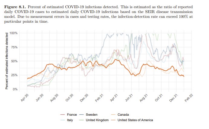
• The infection-detection rate in the US had declined to 22% on January 3.
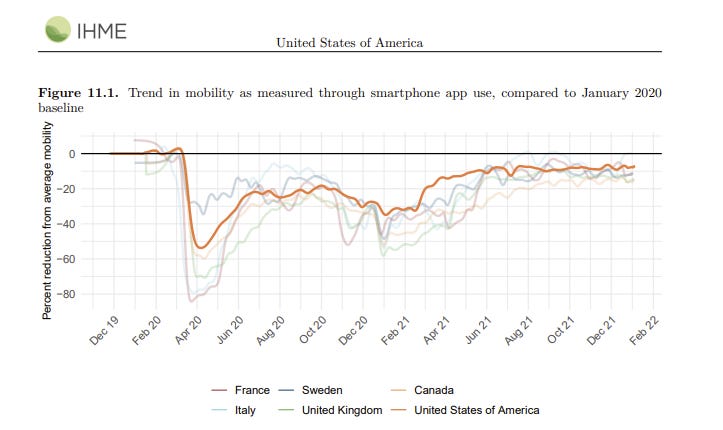
Mobility last week was 7% lower than the pre-COVID-19 baseline (Figure 11.1). Mobility was lower than 30% of baseline in no locations.
A graph I found interesting, on detection rates over time, I’m surprised they think the decline in detection rates was this small recently:
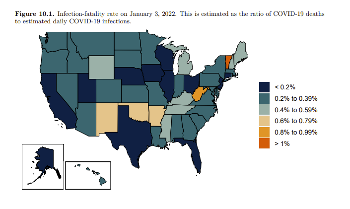
A graph that should make one assume their methodology is wrong:
That number in Vermont is obviously stupid. There’s no way Covid kills people twice as often there as in all but a handful of other states, including all the states around it. I don’t believe the estimates in the other four outlier states either. It’s so weird to put a graph like this in one’s paper and not notice it doesn’t make any sense. Also worth noting that larger population states tend to have lower IFRs here (California, Texas, Florida and Ohio all <0.2%), in a way that doesn’t match anything physically happening. My guess is they are underestimating the true number of cases in New York relative to those places.
I think mobility is a good measure of extreme prevention measures, but a quite poor measure of non-extreme measures. So this is telling us that almost no one is taking extreme measures. I am surprised. If nothing else, something like 10% of people have Covid-19 right now, by their own estimates. Shouldn’t their lack of movement show up on this graph?
I simply don’t believe this graph here?
This shows no increase in test usage. If that’s true, then why are tests suddenly impossible to find? Why are systems backed up? Why does everyone I know report being told to test a lot more? If the answer is ‘we were already at our limit’ then I guess I basically disbelieve that, given we were then at it for three months and nothing changed.
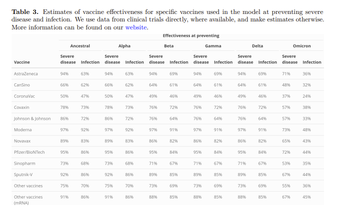
Here are their vaccine effectiveness estimates, presumably unboosted. Note that they continue to believe that the vaccines were still holding up exceptionally well against Delta, and they weren’t losing that with time very much, which suggests that ‘using clinical trial data’ wasn’t serving them well here and they didn’t want to notice.
Projection Graphs
There are five scenarios here but there’s a reason I don’t talk about them before this, they all are effectively the same because it’s too late for prevention to do much.
They have us peaking at roughly 6 million infections per day, which is almost 2% of the population. When I did simple spreadsheet modeling myself I got the peak being somewhat lower and closer to 4 million per day.
One place I definitely disagree is that I do not expect this much drop-off to happen this fast after we peak. Behaviors will adjust, and I do not believe they are taking this into account. This failure matches my understanding of how they’re generating their models, so it’s easy to assume this is as simple a mistake as it appears.
I notice I’m confused how higher severity of Omicron scenario (which I do not believe is going to happen on its merits) causes a lot more hospitalizations but not many more deaths, since those extra hospitalized people should be a big source of more deaths. On top of that, if we did get to 450k hospitalizations, presumably we’d run out of resources in a lot of places.
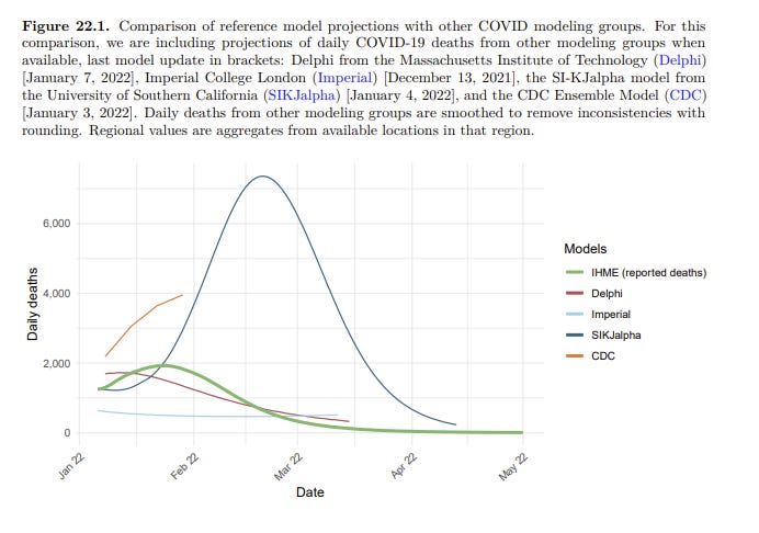
They note other model projections for deaths.
The SIJKalpha model is clearly obvious nonsense. Their GitHub brags about how fast you can run the model rather than explaining what they’re doing. For deaths to peak this late and this high would only make sense if you think we’re mostly catching all the Omicron cases and there’s little dark matter out there? But that’s obviously quite wrong. As a sanity check I looked at their United Kingdom projections, and, well, no.
The CDC model seems like what one would expect if you had some dark matter but much less than you’d expect from the data points we’ve seen, so things don’t peak for a while longer and the true IFR is higher because Omicron is more severe. I don’t think this can match the data either, but it’s at least somewhat less insane.
The London College projection was from early December so I’m not going to be too harsh on them, but it doesn’t seem like it’s predicting the past all that well.
Delphi seems to be in the same universe as the IHME model, and the results seem plausible. Having MIT give you a sanity check seems strong.
Conclusion and Updates
There’s some overlap between my toy modeling and what IHME is doing. They’re more sophisticated in some key ways, although they seem to not be factoring in the control system properly, which is a big omission. What they are predicting here is confirmation that my expectations are reasonable, as is the Delphi/MIT projection.
I’d love to update my confidence levels a lot, but all these models are making similar predictions largely because they are making similar modeling assumptions. Thus, I can be confident that these are the correct predictions to be made given what I think are good and reasonable assumptions, and they line up with the data we see in various places, but this does not protect against errors in those assumptions.
Despite that, I do think this was worth some amount of update, and my main changes are:
More confidence that the broad path of things will be what I expect.
More confidence that hospitals will hold together and death rates won’t be so bad.
Moderately higher expectation for the true peak of cases, closer to their 6 million per day.
Moderately higher expectation about speed and magnitude of decline from peak, although I still don’t think they’re in a reasonable ballpark.
More confidence in IHME and Delphi to give us reasonable projections.



Sounds similar to the Great Barrington Declaration
“Our alternative policy scenarios, including more rapid scale-up of boosters to all who have been previously vaccinated, increasing mask use to 80%, and vaccinating the partially hesitant, have only a small impact on the trajectory over the next 4 months. The speed of the epidemic is so fast that policy interventions will have little impact. In previous waves, the control strategy has been to control infection and thus reduce hospitalization and death. Given that there is little prospect of controlling infection, strategies need to focus on reducing harm in the vulnerable and minimizing disruption.”
I definitely agree with the concept, what's the point of quarantine and disruption if there's no prospect for controlling transmission?
I have two little kids in daycare, aged 2 and 4. The 4-year old tested positive on Fri (4 days ago). The daycare shut down her entire classroom of a dozen kids for 10 days.
Both of my kids have to stay home for 10 days. And, the part that makes even less sense is my 2 year-old has to stay home an *additional* 10 days after that because according to the school "his quarantine would start after her quarantine ends." Is this right?! This leads to the absurd result that if my son actually tests positive, he could go back to school sooner than if he *doesn't* get it. Then again, perhaps it's a foregone conclusion that everyone in our house will get it or already has it--impossible to isolate such small kids--so maybe he won't have to stay home all 20 days anyway. And we got 3 more emails today that people in other classes have tested positive, so maybe other entire classes are also now closed for 10 days.